すたすた式
Blogger QooQ
スマートフォンのときのサイドバーの位置(処理)について悩みましたが、ひとまず左側からだすことにしました。
ボタンはCSSで表示、バックグラウンドのタップでもサイドバーが閉じるようにしました。
サイドバーを横から出すアイデアは【 QooQ カスタマイズ 】 サイドバーをボタンで開閉できるようにする-インドアな日々さん。
ボタンのアニメーションは
3本線のメニューボタンをパネルの開閉にあわせてバツに変化させてみる|Webparkさん。
【JavaScript不要】ハンバーガーメニューの実装方法&解説 | IB-Noteさん。
【QooQ】ナビバー開閉ボタンのカスタマイズ | ふじろじっくさん。
の各記事を参考にさせて頂きました。ありがとうございます。
テンプレート(テーマ)QooQver.2.0.0を使用。
下記2種類の設定で動作を確認しました。
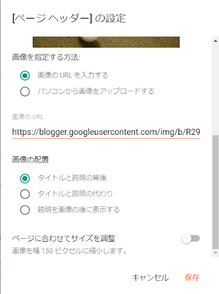
画像の配置で「タイトルと説明の背後」を選択している場合の例
大まかな手順
HTMLを編集します。必ずバックアップを取ってから作業してください。
変更箇所
<div class='container'>
<b:include name='header-title'/>
<b:include name='description'/>
div
button
<div id='header-inner'>を検索
<div id='header-inner'>
<div id='header-inner'>
  <div class='container'>
    <b:include name='header-title'/>
    <b:include name='description'/>
  </div>
</div>
↓↓↓
<div id='header-inner'>
  <div class='container togglebutton-container'>
    <div>
      <b:include name='header-title'/>
      <b:include name='description'/>
    </div>
    <button class='togglebutton' id='togglebutton' type='button'>
      <div class='togglebutton__object' id='togglebutton__object'/>
    </button>
  </div>
</div>
<b:if cond='data:useImage'>を検索
<b:if cond='data:useImage'>
<b:if cond='data:useImage'> <b:if cond='data:imagePlacement == "BEHIND"'> <div expr:style='data:useImage ? "background-image: url(\"" + data:sourceUrl + "\"); " : ""' id='header-inner'> <div class='container'> <b:include name='header-title'/> <b:include name='description'/> </div> </div> <b:else/>
<b:if cond='data:useImage'> <b:if cond='data:imagePlacement == "BEHIND"'> <div expr:style='data:useImage ? "background-image: url(\"" + data:sourceUrl + "\"); " : ""' id='header-inner'> <div class='container togglebutton-container'> <div> <b:include name='header-title'/> <b:include name='description'/> </div> <button class='togglebutton' id='togglebutton' type='button'> <div class='togglebutton__object' id='togglebutton__object'/> </button> </div> </div> <b:else/>
参考:変更箇所のスクリーンショット
バックグラウンドのHTML<div id='sidebar-background-mobile'/>とJavaScriptを</body>の上あたりに設置します。
<div id='sidebar-background-mobile'/>
</body>
<div id='sidebar-background-mobile'/>
<script>
// バックグラウンドのタップでもサイドバーが閉じる
//<![CDATA[
"use strict";
(() => {
  const buttonObject = document.getElementById("togglebutton__object");
  const background = document.getElementById("sidebar-background-mobile");

  const btn = [document.getElementById("togglebutton"), background];
  const obj = [document.getElementById("sub-content"), background];

  btn.forEach((btnElm) => {
    btnElm.addEventListener("click", () => {
      buttonObject.classList.toggle("togglebutton__object--close");

      obj.forEach((objElm) => {
        objElm.classList.toggle("sub-content__sidebar--open");
      });
    });
  });
})();
//]]>
</script>
CSSを設置します。
※CSSは一例です。値などいろいろ変更してください。
/****************************************

    スマートフォンの時にサイドバーを左側から出す

    ヘッダーに設置したトグルボタンで開閉

****************************************/

.togglebutton {
  display: none;
}

@media (max-width: 768px) {
  #sub-content {
    margin-top: 24px;
    background: #f6f5f5;
    overscroll-behavior-y: contain;
    position: fixed;
    top: 0;
    left: 0;
    z-index: 950;
    overflow-y: auto;
    width: 80vw;
    height: 100vh;
    transform: translate(-100%);
    transition: all 0.3s;
  }

  #sidebar-background-mobile {
    display: block;
    background-color: #000;
    width: 100vw;
    z-index: 900;
    position: fixed;
    top: 98px;
    left: 0;
    min-height: 100vh;
    opacity: 0.7;
    transform: translate(-100%);
  }

  #sub-content.sub-content__sidebar--open,
  #sidebar-background-mobile.sub-content__sidebar--open {
    transform: translate(0);
    transition: all 0.3s;
  }

  .togglebutton-container {
    display: flex;
    position: relative;
  }

  .togglebutton {
    position: absolute;
    right: 1em;
    height: 32px;
    width: 32px;
    display: flex;
    justify-content: center;
    align-items: center;
    cursor: pointer;
    background: inherit;
    border-style: none;
    padding: initial;
  }

  .togglebutton__object,
  .togglebutton__object::before,
  .togglebutton__object::after {
    position: absolute;
    display: flex;
    height: 4px;
    width: 32px;
    border-radius: 8px;
    content: "";
    transition: 0.3s;
    background: #fff;
  }

  .togglebutton__object::before {
    bottom: 10px;
  }

  .togglebutton__object::after {
    top: 10px;
  }

  .togglebutton__object.togglebutton__object--close {
    background: transparent;
  }

  .togglebutton__object.togglebutton__object--close::before {
    bottom: 0;
    transform: rotate(45deg);
  }

  .togglebutton__object.togglebutton__object--close::after {
    top: 0;
    transform: rotate(-45deg);
  }
}
CSSでスクロールが連鎖するのを回避する古い方法とoverscroll-behaviorを使った新しいテクニック - コリス
ナビゲーション、ヘッダーを固定するときは以下も追加
@media (max-width: 768px) {
  #navigation {
    position: fixed;
    top: 0;
    left: 0;
    z-index: 1;
    width: 100vw;
  }
  #header {
    position: fixed;
    top: 24px;
    left: 0;
    width: 100vw;
    z-index: 1;
  }
  #main {
    padding-top: 100px;
  }
}
サイト内検索に使ってください 🐤
© 2015 すたすた式
Enjoy!👍
QooQ


コメントなし:
コメントを投稿